The Making of Thistle One PART II — Pre-Production Tips & Tricks For Creating Your Short Film
Part 2 of a 3-Part Series on Creating and Producing a Short Film Project on Artella — The Creative Production Management Platform
By: Bobby Beck, Director of Thistle One and co-founder of the Artella Production Management Platform.
There are thousands of decisions that need to be considered during each stage of a project. While some matter little, pre-production decisions are critical. They set the framework for how you will express your vision throughout. They provide a solid compass for guiding you and your team’s future decisions as the project evolves.
Great tools and communication are key in any production. They’re even more important on a remote production. We proved that during the making of Thistle One. All of our talent was located remotely. No one ever sat in the same room at the same time, yet we were able to work as a team and make it look and feel like we did.
Our first step to getting everyone on the same page was to communicate the mood and feeling of the piece. We started with concept art.
Concept Art: Focusing The Artistic Vision To Set The Tone Of The Film
Pre-production concept art is where you get to explore what the finished product could look like before you ever step foot into production. The work that is created here is both inspirational and motivational to the team. It’s easy to spend a lot of time in this stage. I recommend doing as much concept art as you need to explore and understand what this world looks and feels like. It’s a great way to work out the kinks of design ideas and see what a finished render should look like. But, be careful not to spend too much time here. At some point, you’ll need to pull the trigger and go for it. It’s easy to want to noodle forever.
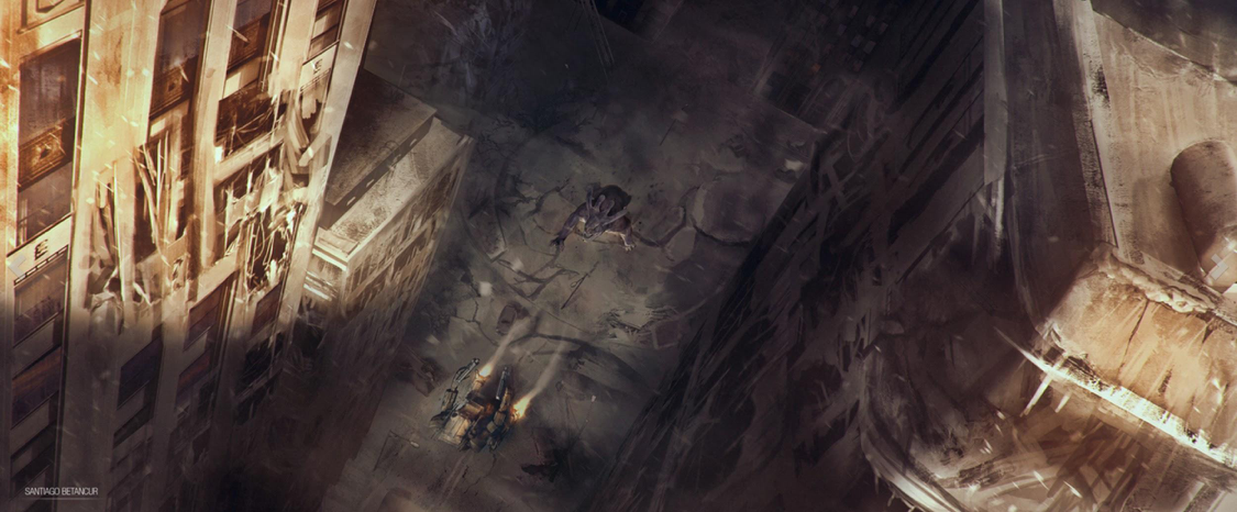
This concept art piece and the featured image at the top of the page were
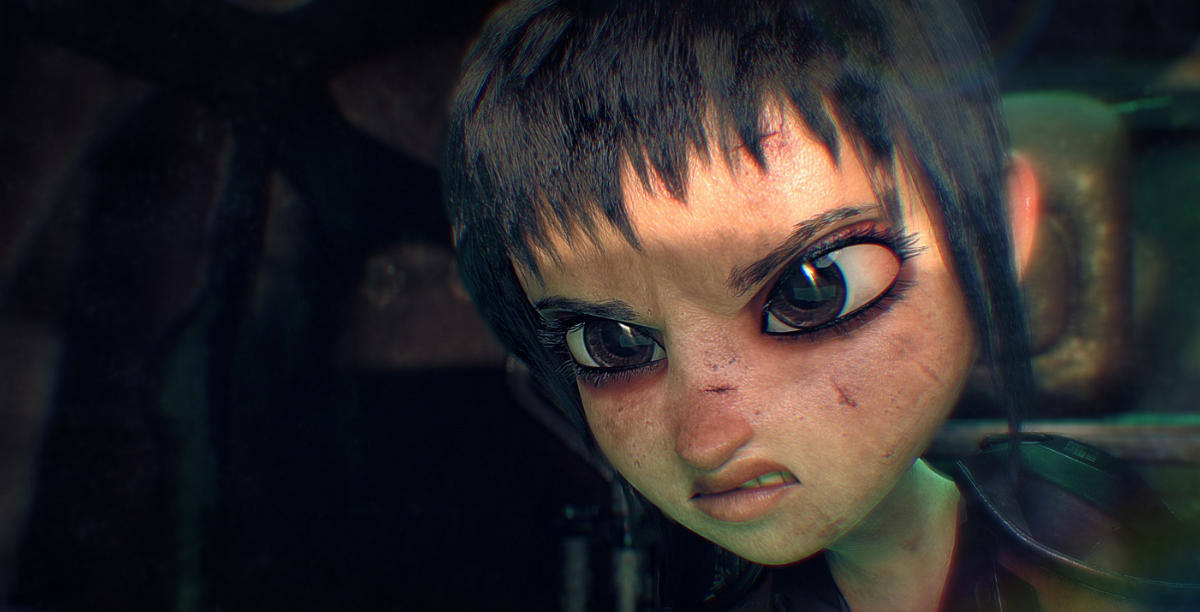
created by Santiago Betancur
Santiago Betancur was our key concept artist and is based in Colombia. He would post his work on the project feed and I’d give him notes with draw-overs via the review tool. We communicated back-and-forth this way in real time. I looked forward to waking up the next day to see what he’d created. Usually, it was something that totally blew my mind. It was also great that the rest of the team could see this work too, as it developed. The work was motivational and got the team engaged. Everyone was able to join in and offer encouraging words along the way.
Previs – and Why We Skipped Storyboarding in the Pre-Production Phase
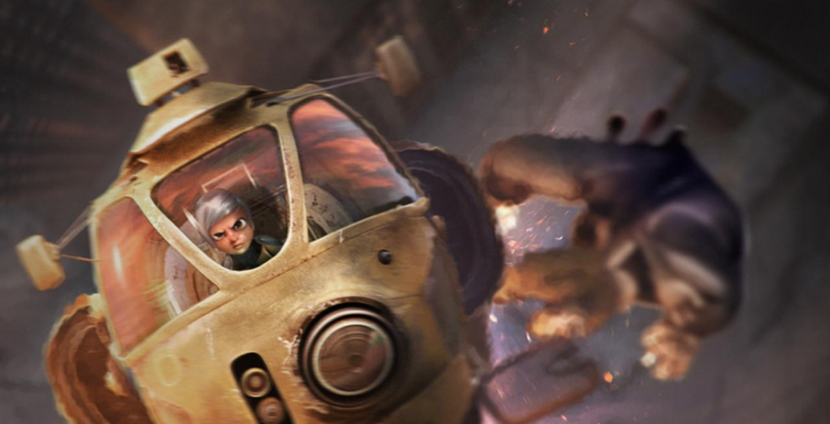
We created Thistle One to be high energy and feel very dynamic. For that reason, we skipped storyboarding all together and worked first in previs. This allowed us to get a feeling for the pace and energy of the film up front. As we mentioned in our last post, we were able to evolve the pace into something more nuanced that better served the tone we were going for. Doing that before we started animating saved us a ton of time and rework once we got further into the process.
To save time, during previs we made sure our characters, props and set stand-ins (boxes, cubes, and proxy characters) were the same size as our final characters, props, and sets. That way we didn’t have to recreate the previs cameras a second time when we went into animation. By doing it this way, we were able to get very dynamic movement and flow between the shots in a rough state. We tweaked the flow throughout the animation process and even cut a couple of shots that no longer served the flow once we got into them.
I definitely don’t knock storyboarding as a key process in filmmaking, but, for us, it was a good decision to get the flow worked out in 3D instead of trying to force that in storyboards.
How The Color Script Communicated Key Moments
I never really thought about color arcs before I went to a talk by Jorge Gutierrez who’s famous for his work on The Book of Life. In that session, he talked about color arcs and how he always thinks about that in his films. Even though Thistle One is short, I wanted to take that knowledge and apply it to our project.
I decided that I wanted to have the colors start more cool with blues and grays to represent danger, fear and the desolation of this world. Over the course of the short, the sun begins to rise and the colors become warmer. The warming color of the sun mirrored our protagonist taking control of the situation and signaled hope. At the end, I brought the colors back down to give it a sense of mystery so that the audience is uncertain what will happen next.
Even in a short film, we worked hard to make every pre-production decision intentional.
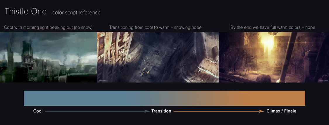
Concept piece to remind us about the color arc throughout production.
Creating Color Keys
During animation, but before lighting, we created a color script for each shot to give the lighters an idea of the tone and color changes. This helped a ton when we got into lighting, but we did find the transition was too abrupt so we worked later with a mixture of lighting and comp to smooth out the transition.
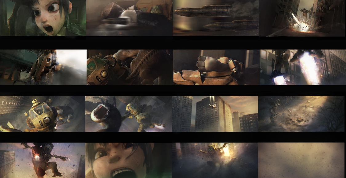
Martin Bailly (France) and Arturo Rodriguez (Mexico) were our two color key artists. They worked and reworked the short several times until we found the look and mood that felt right.
Although pre-production is meant to give you an idea of where your production will go, it’s important to be flexible and make changes where necessary to get a better outcome in the end. In part 3 we’ll dive into the production stage of the film-making process.
